“Design adds value faster than it adds cost.” – Joel Spolsky, Founder, Trello.
A well-crafted user experience has always been the key to a successful eCommerce store. Businesses focus on this aspect right from the outset. A pleasant user experience is a visual proof that the customers are going to have the best shopping experience on your e-store. And that makes UX one of the most decisive elements of an ecommerce strategy.
Ecommerce owners have tried out various tactics to convert more visitors, engage them, and retain them for a long time. It is crucial that eCommerce owners see their store from their customers’ perspectives. Only the right user intent can help them find the precise strategy to convert their visitors to returning customers.
Through this blog, we will discuss some key practices for an engaging ecommerce user experience. As always, this comes straight from our most recent experiences delivering BigCommerce development services to our client and helping him establish a custom BigCommerce online store.
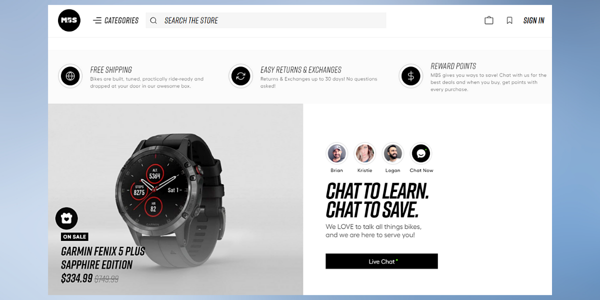
Following is a glimpse of the home page we designed for the client:
Before delving deeper into the implementation, let’s have a clear understanding of what is ecommerce UX and why it is so elemental.
What is Ecommerce User Experience
Ecommerce UX comprises everything a shopper experiences throughout the buying process. It starts with their first interaction with the online store to placing the order and everything in between. The efficiency of your store’s user experience directly depends upon how seamless it is for your prospects to navigate, find their product and place an order.
Rank your store’s user experience based on the following capabilities:
- Swift loading time under 3 seconds
- Ease of navigation
- Ease of discovering and options to buy them with minimum distractions
- Pleasant store experience on the mobile device
- Removal of redundant steps
These are some of the most essential capabilities an eCommerce store needs to incorporate in its user experience..
Ecommerce UX Benefits
Hubspot confirms that
“88% of online consumers are less likely to return to a site after a bad experience”
A poorly designed ecommerce store can repel customers. On the other hand, a store with a pleasant user experience gives you an edge over your competitors even if they are selling at a similar price. More advantages follow with an excellent eCommerce UX, which include:
- Reduced Cart Abandonment rate
- Converting more visitors
- More customer satisfaction
- Increased repeat purchases
- Quality referrals from your customers
Above all, your store can offer a personalized experience to your customers. Notice how Amazon suggests products based on your past order history? Your store can offer a similar personalized shopping experience where the store is capable of anticipating customer’s needs. Your customers will feel encouraged when the store puts forward relevant upsell and cross-sell tactics.
So, how did we optimize Bigcommerce store UX for our client?
Our most recent collaboration with a Fitness store turned out to be an experience worth sharing.
Business Challenge: Product Discoverability
The website faced the following issues:
- Inability to showcase products to full capacity
- Inability to find the closest products on the user’s search query
Our Approach: Optimize Bigcommerce store UX
The Ecommerce website development team at The Brihaspati Infotech has delivered some excellent solutions in the past in order to provide a never-before buying experience. The team practices numerous tactics to ensure that the users have a smooth store experience. Some of these tactics are:
→ Infinite Scrolling: Users can scroll the product catalog without having to navigate between multiple pages.
→ One page checkout: Reduces the time taken to fill the checkout form.
→ Ecommerce PWA: Provide native app-like features on a mobile browser. Read our accomplishment at developing a custom Shopify checkout app here.
After a series of brainstorming sessions, our team of Bigcommerce experts was able to deliver an intuitive, engaging, and conversion focussed ecommerce store design with the following features:
1. Improving eCommerce UX: Detailed Product Page
An ecommerce product detail page can make or break a sale. Customers make decisions on your product page. Lack of information about the product bars your users from clearly understanding your product. On the contrary, too much information implies your users are most likely to skip the content even before reading it.
The product detail page generally contains the following:
- Product Image
- Product name
- Descriptions
- Specifications
- Shipping and return policy
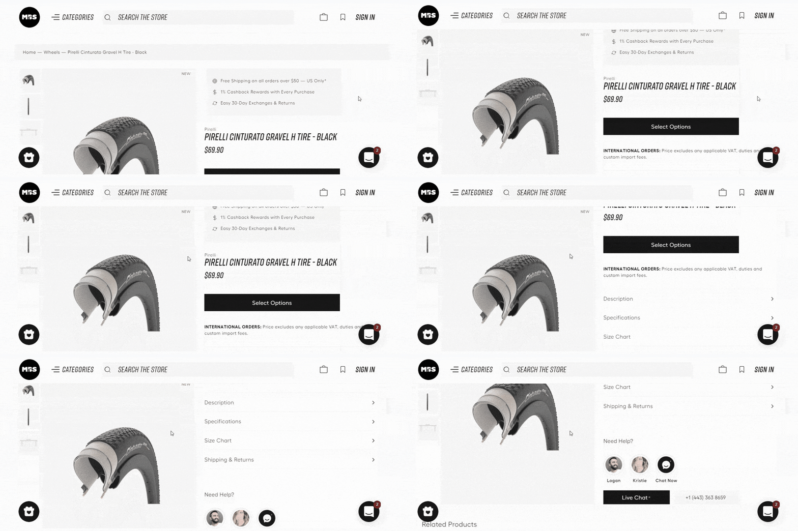
We came up with the idea to limit all the product details to fewer screens. Customers can thus find all the product details in condensed sections, which gives them a complete overview.
Our experts have furthered the product detail page with parallax scrolling. The product is locked on the left side of the page while the customer can scroll through the other half. The parallax scrolling feature almost gives the feeling that every detail is a part of the product.
Delivering an out-of-the-box feature, such as parallax scrolling can be challenging. If not done right, customers will feel confused and few sections will be needlessly overlapped. The added animation can further burden your website resulting in frequent lags and glitches.
An experienced team of ecommerce website designers can counter these roadblocks. The team will ensure that the design is precisely at its place while the page loading speed too is taken good care of.
2. Improving eCommerce UX: Intuitive Navigation
One of the major challenges the client found with the conventional Bigcommerce UX was managing the diverse collection of products. Creating a mega menu was an easy solution here. However, considering that it will cover a majority of the screen, we had to look out for an efficient alternative.
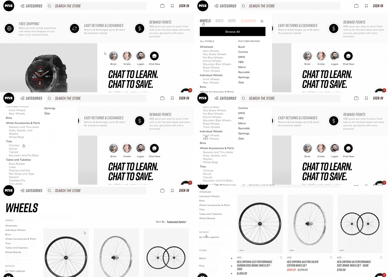
Our Bigcommerce experts brainstormed the problem and came up with a custom menu option that allows users to navigate between product categories easily. The menu has separate options for each category. Each product category is further divided into subcategories allowing the client to showcase all the products on the same menu.
Furthermore, our experts have added a custom “Browse all” button for each product category. The option redirects the user to a complete catalog for the said product category, as shown in the Gif below:
3. Improving eCommerce UX: Smart Internal Search
An ecommerce site search helps users to find the exact products they have been looking for. The Bigcommerce app marketplace has some handy apps that could readily provide an internal search engine for the store. Users can type the desired product they are looking for, and the third-party application readily finds them the said product.
However, the same application also limits the scope of searching to just the keywords. If the app finds it, a purchase is made. Otherwise, your store is ready to lose another customer.
Our experts came up with a plan. The new internal search engine is capable of suggesting related searches apart from the regular product search. As a result, when a user searches a product, say “Tyre”, the smart internal engine also suggests terms like “Tyre key”, “tyrewiz”, etc., as shown below:
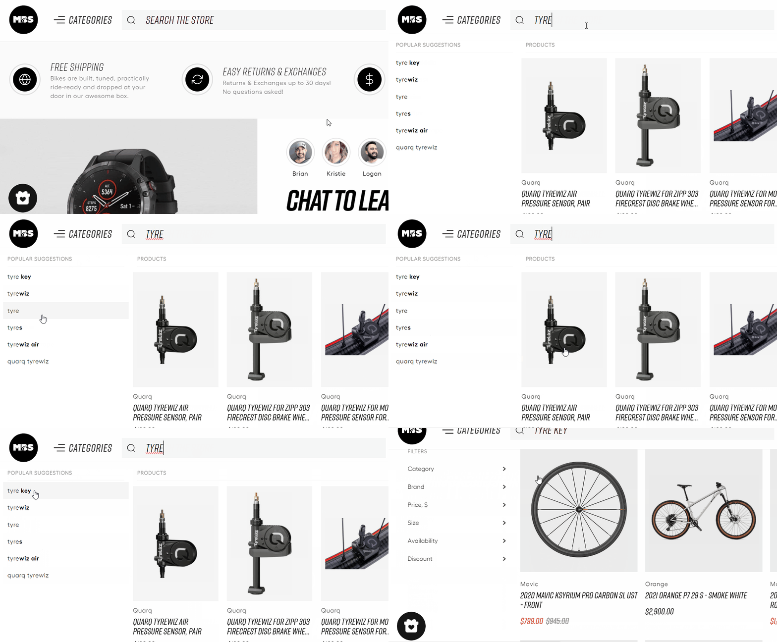
The internal search thus works more like a cross-selling feature that allows users to find something more relevant, if not exact. The users can always find the search option regardless of the page they are on. The feature makes sure that your visitors are buying something before they depart.
4. Improving eCommerce UX: Mobile Ecommerce UI
Mobile commerce has been dominating desktop browsing for quite some time now. The growing prominence of the smaller screen assures that the margin will only increase in the coming times.
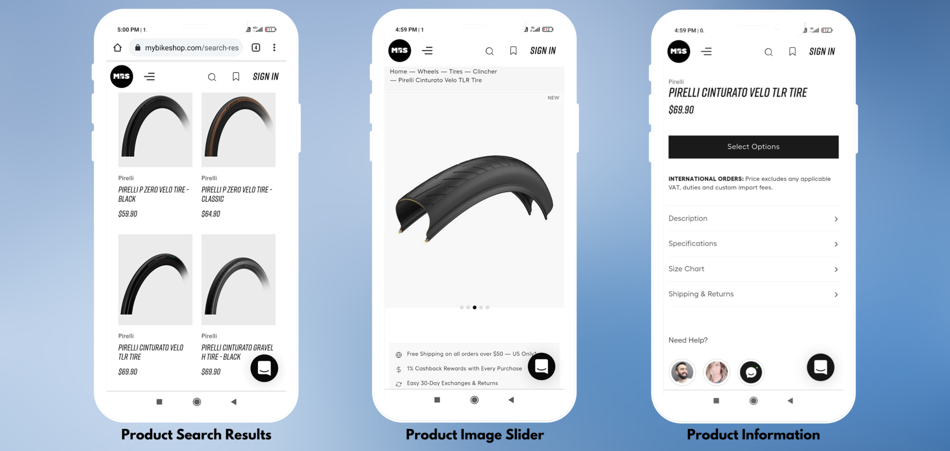
With that in mind, our developers have given special attention to the user experience on mobile screens. The Bigcommerce store is highly mobile responsive, allowing users to access every function with ease. The font size and product images were taken special care of ensuring that every part is clearly visible on the smaller screen.
5. Improving eCommerce UX: Product Personalization
“80% of the shoppers are more likely to make a purchase if the store offers personalized experience” – Epsilon
Product personalization allows your customers to buy products that are perfectly tailored to their demands- in terms of color and features. With an effective product configuration strategy, you open yourself for upselling, in the form of accessories.
Our Bigcommerce developer team implemented a product configurator for the store letting customers personalize their bikes. Initially, the configurator options are kept hidden to make the product detail page look minimal. Customers opt for the customization with “Select Options” that leads them to the desired fields, as shown below:
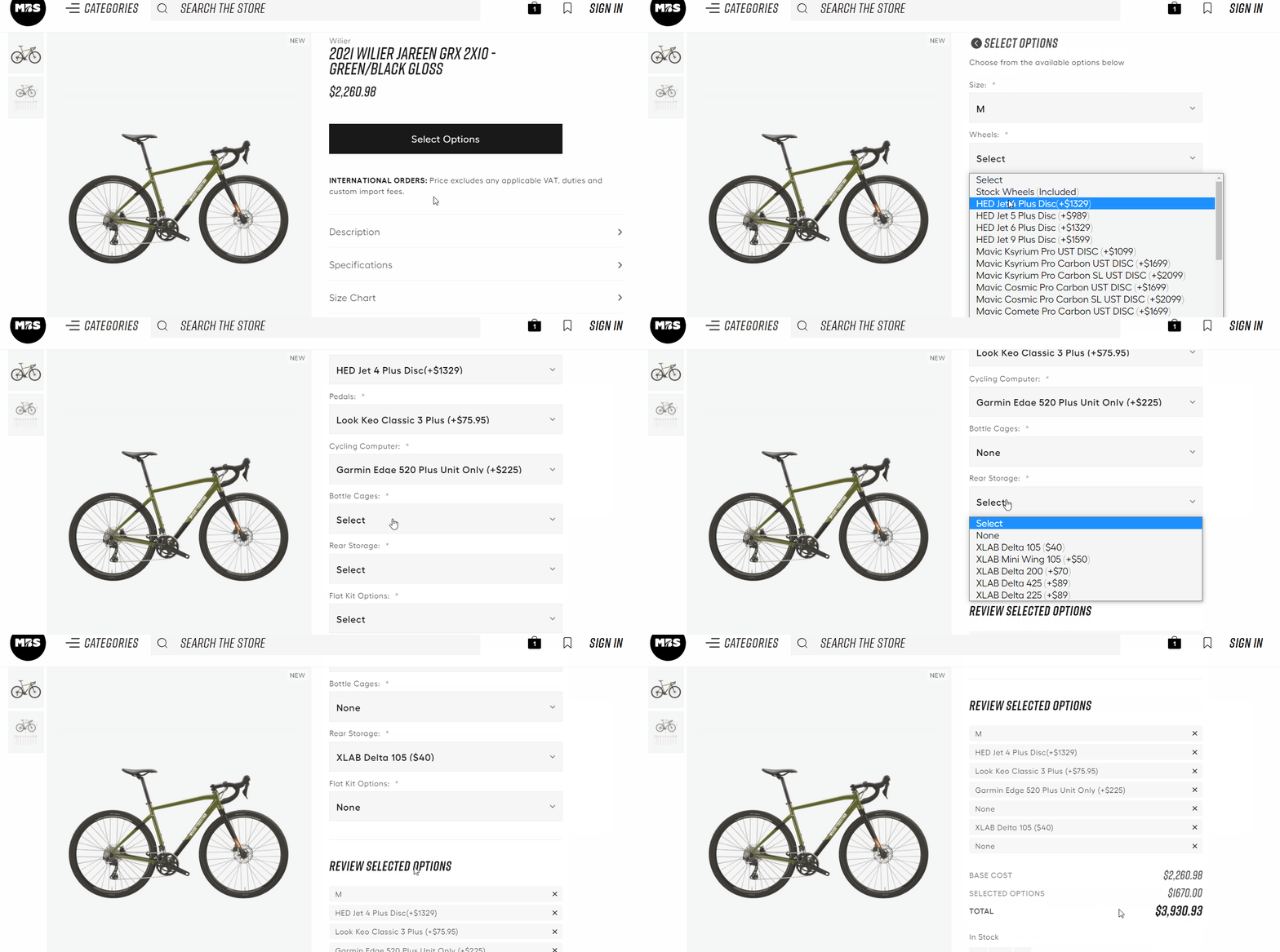
It is worth noticing that the final price of the bike includes the cost of customization along with the base price of the product.
The store creates a separate page for products added to the cart. Customers can check all the products in their cart along with the customizations they have opted for. The shoppers can further modify the configurations from here. The “Modify Options” at the bottom of the products opens a further popup to modify the product.
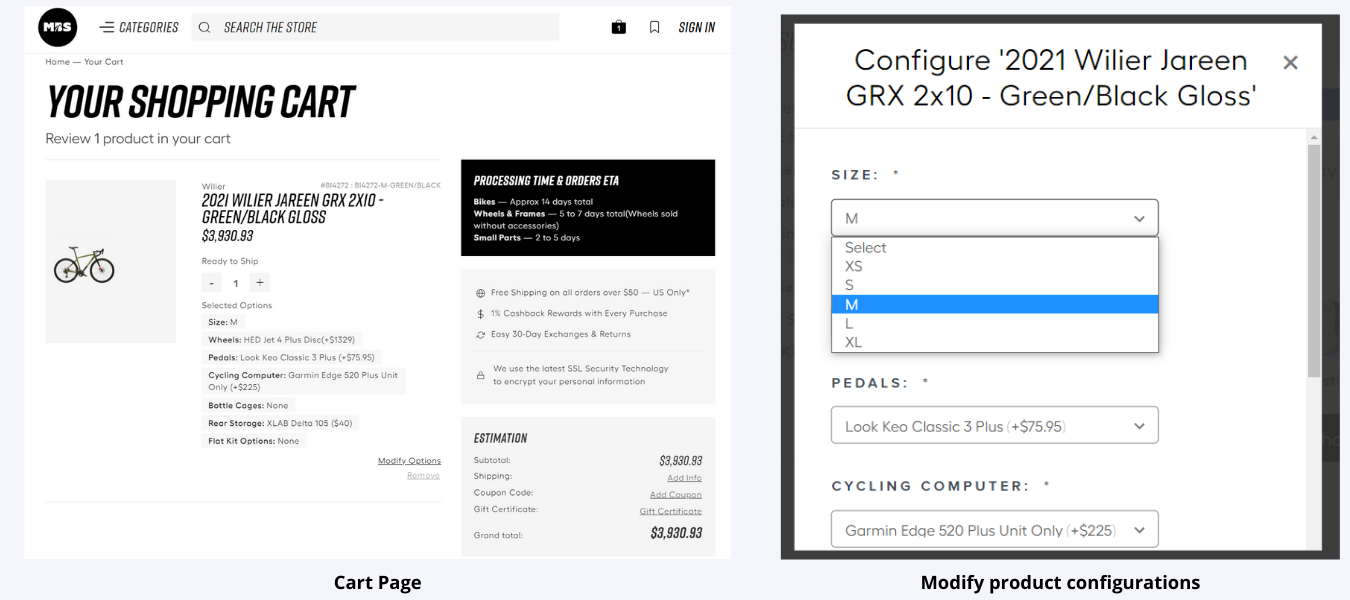
The feature is one of a kind and lets your customers modify their products without actually removing the product and repeat the configurations over and over again.
With that, our eCommerce development team was able to deliver a conversion-focused Bigcommerce store. The store offers a clear and concise user interface, with clear instructions almost like guiding the visitors to make their first purchase.
The Brihaspati Infotech has delivered several intuitive stores in the past, built from scratch. The stores are industry-specific and designed keeping in the eye of the client’s business needs. In one of the recent blogs, we have discussed the development of an Arabic Multilingual Online store. The store is specially designed keeping in the eye of the Arabic reading and writing conventions.
Final words on Ecommerce User Experience
There’s a popular saying among designers- “Good design is invisible.” It goes unnoticed, but it is there, making the user’s life easier. UI elements that were once designed to allure customers, should not pause them. Simple design and ease to use are everything your ecommerce store needs.
If you are willing to launch a Bigcommerce store from scratch you can hire Bigcommerce experts from us. The team will help you convert more visitors with their abilities at designing user-oriented Bigcommerce stores.
Stay Tuned for Latest Updates
Fill out the form to subscribe to our newsletter
