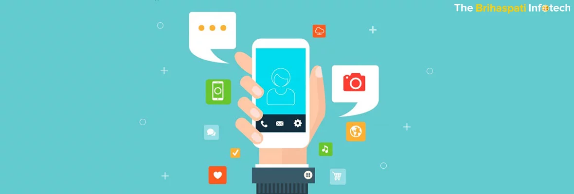
iOS Design Guidelines
 Published on May 25, 2015 • Updated on December 9, 2023 •
  9 min Read
 The iOS design guidelines for finding complete and correct information about all of iOS devices, help to ease a designer to design a particular iOS app. These guidelines follow the official HIG for iOS and can not be done with custom controls. So do not hesitate to break the rules. This document is a unique guide to know the basic iOS UI Design Guidelines.
iOS design describes design patterns and themes having motivated iOS with the best means to incorporate an app with the UI.
Here are some basic iOS design guidelines to follow that give the best of users experience :
- Correctly Using iOS UI Standard Elements offered by UI kit.
- Mixing of styles from various different iOS UI elements should be avoided.
- Creating a customized UI element performing a standard action should be avoided.
- Never try to use some meaningful system-defined icons and buttons.
- Reasonably create custom controls thoroughly, if an app is enabled as an experience or an immersive task.
- An App works well to view document library to open an existing document and create a new one. Document library ideally view:
- High Graphical Document
- Making the minimum gestures to people.
- Tapping a place holder image for creating a new document.
- Assuring people to preserve their document until unless it is explicitly cancelled or deleted
- Mostly configuration options offered in the main UI.
- In Settings, when necessary, users can directly go to an App’s settings.
- iOS Technologies supports common tasks & scenarios as per users expectations
iOS Design Guidelines Description for Display & Resolutions
|
Device |
Retina |
Landscape (pixel) |
Portrait (pixel) |
| iPadMini 1st & 2nd Gen | No | 1024 x 768 | 768 x 1024 |
| iPad Mini 2nd & 3rd Gen | Retina | 2048 x 1536 | 1536 x 2048 |
| iPad Air / Retina iPad 1st & 2nd Gen / 3rd & 4th Gen | No | 2048 x 1536 | 1536 x 2048 |
| Iphone 1st, 2nd & 3rd Gen | No | 480 x 320 | 320 x 480 |
| iphone 4, 4S | Retina | 960 x 640 | 640 x 960 |
| iPhone 5, 5S, 5C | Retina | 1136 x 640 | 640 x 1136 |
| iPhone 6 | Retina | 1334 x 750 | 750 x 1334 |
| iPhone 6+ | Retina HD | 1920 x1080 | 1080 x 1920 |
Always think in points & design in pixels, while designing for various displays. Essentially export all assets in 3 different resolutions, irrespective of in which resolution an app is designed by a designer.
Always refer to points, when it comes to specific dimensions.
|
Device |
Resolution |
Display Size |
PPI |
|
iPad1st & 2nd Gen |
@1x |
9.7″ |
132 |
|
iPad Mini1st Gen |
@1x |
7.9″ |
163 |
|
iPad Mini2nd & 3rd Gen |
@2x |
7.9″ |
326 |
|
iPad Air / Retina iPad1st & 2nd Gen/ 3rd & 4th |
@2x |
9.7″ |
264 |
|
iPhone1st, 2nd & 3rd Gen |
@1x |
3.5″ |
163 |
|
iPhone 4, 4S |
@2x |
3.5″ |
326 |
|
iPhone 5, 5S, 5C |
@2x |
4.0″ |
326 |
|
iPhone 6 |
@2x |
4.7″ |
326 |
|
iPhone 6+ |
@3x |
5.5″ |
401 |
On all iOS devices, physical and rendered pixels are equal, except eRetina HD screen of the iPhone 6 Plus, which has a lower pixel resolution than a natural at 3x. Moreover, the provided content is resized automatically to 87% of the actual size.
iOS App Icons Guidelines
| Device | App Icon | AppStore Icon | Spotlight | Settings |
|---|---|---|---|---|
| iPhone 6+ | 180×180 px | 1024×1024 px | 120×120 px | 87×87 px |
| iPhone 6, 5S, 5, 5C, 4S, 4 | 120×120 px | 1024×1024 px | 80×80 px | 58×58 px |
| Old iPhones 1st, 2nd, 3rd Generation | 57×57 px | 1024×1024 px | 29×29 px | 29×29 px |
| Retina iPadsMini 2 & 3, Air, 3 & 4 | 152×152 px | 1024×1024 px | 80×80 px | 58×58 px |
| Old iPads1, 2, Mini 1 | 76×76 px | 1024×1024 px | 40×40 px | 29×29 px |
Design Effects Applied Automatically…
Assets of iOS App icons are added in various dimensions to the application package as plain and squared PNG files. iOS employs different effects to icons of an app on a device.
Corners Round
Rounded corners simple old radii values are obsolete now, since iOS 7 app icons have been using the super ellipse shape. iOS did not release the shape of an official template, so to replicate the shape accurately use one of the unofficial templates.
It is sometimes hard to design iOS apps. Generally, in the final assets export, rounded corners should not be added, but it might be required in a design process to add effects i.e. shadows or a stroke.
While masking icon asset with the super-ellipse shape, to apply corner aligned effect, it should be ensured never to use any transparency outside the mask area. For app icons transparency is not supported completely and depicted as plain black. Small black fragments will be seen on the rounded edges, if mask is not 100% accurate. Hence, set the canvas background same as the app icon background. While using a white background app icon, apply a 1-pixel gray border stroke for making icon edges easier to recognize. This can be done in the settings and the App Store.
Effects of Legacy (iOS 6 and older versions)
Automatically these effects are applied in older versions of iOS, i.e corners rounded (different shape as used in iOS 7+ icons). Also, on the home screen, a gloss effect and drop shadows can be disabled.
Grid system
To correctly size and align icon elements a golden ratio grid system is developed by iOS. Break the rules freely, if without aligning all elements strictly to the grid icon simply works well.
Fonts
By default font on all iOS versions is Helvetica Neue. Since iOS 7, Apple has been using a slightly modified fonts versions. Many alternative font faces are also available. Find a complete list of pre-installed typefaces.
Be careful about any True Type Font (.ttf) licenses required for an iOS app. It is expensive to secure commercial fonts, as app licenses for them are rarely available. Use completely free fonts safe for commercial usage.
Colors
Since iOS 7, Apple has been using a palette with vibrant colors for the the iOS user interfaces and pre-installed apps. Here, both the default iOS color palette and own colors can be used.
Icons
Icons provides a great support to text labels with a visual relationship & to completely replace text i.e. for common actions such as „New“, „Delete“, etc. dealing with icons that are part of the Navigation Bar, Tool Bar or Tab Bar. Bars Icons should have two different states: the default state in outlined style with I pt or 1.5pt stroke width and the active state with a solid color fill.
Any additional effects should not be included on button icons (i.e. a drop-shadow or inner shadows), relict from previous iOS versions.
On a transparent background, draw one solid color. Use the shape of the icon as a mask, and apply the color programmatically.
Share Popover or Activity View icons are used to be designed in outline style. Since iOS 8, on a plain white background, Apple has turned back to icons with solid fill.
COMMON iOS DESIGN GUIDELINES ELEMENTS
To quickly build interfaces, iOS guidelines offers to app developers a big collection of ready-to-use views and controls. We can customize some elements. While designing an iOS app, stick to a set of tools. It might be worth to build a custom control for a more customized look or to change the functionality of existing control. Sometimes, it may be wise to break the rules, but before any change always think twice.
Status Bar
The content of the status bar shows two styles, i.e. dark black and light white, to match the app style and readability.
Think twice to hide the Status Bar. Status Bar can be hide to remove all distractions from a single element, i.e., when contents are displayed on a full screen like in an image gallery.
Navigation Bar
The background navigation bar by default is slightly blurs and translucent the content underneath the bar. Set the bar background fill to a gradient, a solid color, and a custom bitmap-pattern.
There should be a specific alignment pattern:
-
The left side alignment of Back button.
-
In the bar, the title of current view always should be in center.
-
The right side alignment of Action buttons.
On iPhone 6 Navigation Bar should be in portrait mode, except on iPads. and in landscape mode, a common practice is to hide the status bar.
Toolbar
The background fill of toolbars can be modified just like the navigation bar . By default it is translucent and blurs the underlying content. In the navigation bar toolbars should be used when a specific view requires more than three primary actions that would hardly fit or look messy.
Search Bar
By default it comes in two different styles: prominent and minimal, with same functionality. In the context of the search, to introduce the functionality, make use of a prompt with search bars as a short sentence, i.e. Enter a city, zip code or airport. Search bar style, with a prompt and without … providing more control over a search query.
The search bar & scope bar uses the same style and
beneficial when there are clearly defined categories for the search results. i.e. The search results in a music app can be filtered again by interpreters, albums or songs.
Tab Bar
There are a maximum fixed number of tabs contained in a tab bar. If more tabs are present than the maximum count, a “More-tab” that leads to a list of hidden tabs replaces the last displayed tab to re-order.
On iPhones the maximum tabs displayed are five and on the iPad it’s maximum up to seven tabs while avoiding a more-tab. Sometimes it makes a sense to apply a badge count to a tab bar button to notify users about new information on a view. Temporarily disabled view of the related tab button should be faded out to
visually communicate the disabled state & should not be completely hidden.
TABLE VIEW
Depending on the type of presenting data, there are two basic table view types that should be used.
Plain
A number of rows are contained in a plain table having a header on the top and footer after the last row. Here, It’s possible to display a vertical navigation through the table on the right edge of the screen, while presenting a big data set that could be sorted. (e.g., alphabetically descending).
Grouped
Organize rows in groups with a grouped table. Each group have a header (used to describe the context for the group) as well as a footer (good for help text, etc.).A grouped table should have at least one group, and each group needs to contain at least one row. A few styles are available to present the data for both table view types, in a way that allows users to easily scan, read and somewhat modify it.
Default
In default style a table row has an optional image aligned on the left and a title.
With Subtitle
A small subtitle text underneath the row title is enabled with the subtitle table style. Beneficial for further explanations or short descriptions.
Value table
Display a specific value that is related to the row title by the value table style. Each row can have an image and a title that are both aligned to the left similar to the default style. The title follows the right aligned label for the value, usually displayed in a slightly more subtle text color than the title.
POPOVERS, ALERTS & MODALS
To display, edit and manipulate data in a way that fits best in a given situation iOS provides various styles of temporary views that can be used. Each temporary view looks different and exists for a very specific purpose. One thing in common to all temporary views i.e. it’s the highest index
layer on the current view when displayed, and underneath content is overlayed by a translucent black background.
Activity Design View
Follow the same guidelines as for the active state of bar button icons, when design icons for custom task buttons like— solid fill, no effects, on a transparent background.
Actions
Action Sheets perform one single action from a list of available actions and to force the app user to confirm an action or cancel it. Actions are always displayed as a list of buttons sliding in and staying at the bottom edge of the screen in portrait mode and on small landscape screen resolutions. So, an action sheet should have a cancel button to close the view and not perform any of the listed actions. If enough space available (e.g., on iPad screens), action sheets visually transform into popovers.
Tapping a target anywhere outside the popover will close it automatically.
Alerts
An alert view usually contain a title text, should not be longer than one line and one (for informational alerts, e.g., „OK“) or two (for alerts that require a decision, e.g., „Send“and „Cancel“) buttons.If needed, a message text can be added as up to two text input fields, one can be a masked input field appropriate for sensitive information like passwords or PINs.
Edit Menu
Allows users to perform actions when an element is selected (text, images, others) such as Copy, Paste, Cut, etc. It is possible to control which operations the user can choose from. Unless you build your own completely custom edit menu, the visual appearance of edit menus is
set and not configurable.
Popover
When a specific action requires multiple user inputs before proceeding, popovers are useful. Example is adding an item having a few attributes that need to be set before the item can be created.A popover background uses a slightly reduced opacity and blurs the content underneath similar
to many other UI elements have done since iOS 7.
As a powerful temporary view, a popover can contain various objects such as its own navigation bar, table views, maps or web views. Due to the number of contained elements, whenever a popover grows in size and reaches the bottom edge of the view port, it is possible to scroll within the popover.
Modals
As a useful view for tasks modals require multiple commands or inputs by the user. Always appear on top and while open, block interaction with any other interactive elements underneath.
Three different modal styles are:
- Full screen: covers the entire screen.
- Page sheet: In portrait mode, the modal partially covers the underlying content, leaving only a small portion of the parent view visible underneath the translucent black background. In landscape mode, it acts just like a full screen modal.
- Form sheet: In portrait mode, the modal appears in the center of the screen, keeping the surrounding content of the parent view visible underneath the translucent black background. When a keyboard needs to be displayed, the position of the modal adjusts automatically. In landscape mode, the page sheet modal acts just like a full screen modal.
CONTROLS
For basically any required input type iOS provides a wide range of controls. Commonly used controls are listed below:
Buttons
Overall good old button is the most used control. The default button design, since iOS 7, hasn’t really looked like a button, but rather more like a plain text link. Highly customizable button control allows styling everything from text style, drop shadows and color to an icon that is either prepended or centered if there is no text label, as well as fully custom backgrounds. A button can have several states, which should be communicated with visual language: default, highlighted, selected and disabled.
Pickers
From a list of available values, pickers are used to select one value. A date picker is an extended version of picker and allows the user to scroll through a list of dates and times and select values for day, month and time.
Left: date picker displayed inside a table view, right: picker as keyboard. It is not possible to change the visual style or size of a picker control except for the background color. They appear mostly at the bottom of the screens, where keyboards appear as well, and possible to use them in other positions.
Segment Controls
Contains a set of segments (minimum two) that can be used for things like filtering content or to create tabs for clearly categorized content types.
Segment control without and with icons. Every segment contains a text label or an image icon, but never both. Control is not recommended using a
mixed set of segment types (text and images) in one segment. Based on the number of segments (two segments: 50% of total control width, 5 segments: 20% of total control width), the width of one segment changes automatically.
Sliders
From a range of allowed values, the slider control allows the user to choose one specific value.Sliders are recommended for selecting an estimated but not exact value, since choosing a value works pretty smoothly and without any steps. For example, for setting the sound volume, a slider would be a good control, since the user can hear the difference and can see the difference between loud and very loud, but a text input to set an exact dB value would be impractical.
Slider control without and with descriptive icons. Set icons for the minimum and the maximum value, which are displayed on the start and end edge of the slider control, thereby visually embrace the purpose of the slider.
Stepper
When the user enter an exact value from a limited range of possible values (e.g., 1-10) steppers should be used. It contains two segmented buttons, for lowering and raising the current value.
Stepper control is highly customizable, Visually :
-
- Use your own icons for stepper buttons
- While maintaining the native iOS look, customize the color of borders, background and icons by using a tint color, which sets the color for each of these elements automatically.
- While going further, use completely custom background images for the stepper buttons as well as for the separator.
Switch
The user can quickly toggle between two possible states: on and off with the switch. The color for the on and off states can be customized, but the appearance of the toggle button and size of the switch are set and cannot be changed.
Keyboards
To provide the best possible keyboard for a specific text input various keyboard types are available. One can build his own completely custom keyboard, in style or size default keyboards cannot be customized.
Create a new App & redesign an older app with following Approaches:
- Endure app’s core functionality relevance with UI.
- Use iOS themes to inform the UI design and the user experience. Add details and embellishments with care.
- Enjoy the app in many contexts by designing compatible UI with various iOS devices and modes.
Almost all iOS apps design use at least some of the UI components defined by the UI Kit framework. Knowing the names, roles, and capabilities of these basic components helps to make informed decisions to design the UI of iOS app.
The UI elements provided by UI Kit fall into four broad categories:
Bars, Content views, Controls & Temporary views.In addition to defining UI design elements, UI Kit defines objects that implement functionality, such as gesture recognition, drawing, accessibility, and printing support.
Programmatically, a UI element is a type of view because it inherits from UI View. A view knows how to draw itself onscreen, and it knows when a user touches within its bounds. Controls (such as buttons and sliders), content views (such as collection views and table views), and temporary views (such as alerts and action sheets) are all types of views.
To manage a set or hierarchy of views in an app, typically use a view controller. A view controller coordinates the display of views, implements the functionality behind user interactions, and can manage transitions from one screen to another. For example, Settings uses a navigation controller to display its hierarchy of views.
Here’s an example of how views and view controllers can combine to present the UI of an iOS app.
Content Defer
At its heart, the user’s content is despite crisp, beautiful UI and fluid motions are highlights of the iOS experience. Ensure that functionality is elevated by designs and defer to the user’s content.
Advantage of the whole screen
“Weather” is an ideal example for this.The depiction of a beautiful, full-screen location’s current weather, instantly conveys the most
important information.
Visual indicators of realism & physicality:
Edges, gradients, and drop shadows may lead to heavier UI elements that can compete & overpower with the content. Focus on the content and let the UI play a supporting role.
Translucent UI elements hint at the content behind them.
Control center as translucent element provide context and helps users to see availability of more content to signal transience.A translucent element only blurs the content directly behind it like a rice paper and doesn’t blur the rest of the screen.
Clarity
Providing clarity to content is a paramount in an app. To make the most important content and functionality clear and easy to interact:
Negative space:
Negative space makes important content and functionality more noticeable and easier to understand. It imparts a sense of calm and tranquility, and make an a pp look more focused and efficient.
Color:
A key color—i.e. yellow in Notes highlights important state and subtly indicates interactivity and also gives an app a consistent visual theme. The built-in apps use a family of pure, clean system colors that look good at every tint and on both dark and light backgrounds.
Ensure legibility using system fonts
. iOS system fonts, automatically adjust letter spacing and line height so that text is easy to read and looks great at every size. While using system or custom fonts, be sure to adopt Dynamic Type, so that app can respond choosing a different text size.
Borderless buttons.
All bar buttons, by default are borderless. A borderless button in content areas uses context, color, and a call-to-action title to indicate interactivity.
A content-area button can display a thin border or tinted background that makes it distinctive.
Depth to Communicate
iOS displays content in distinct layers that convey hierarchy and position, and that help users understand the relationships among onscreen objects.
Using a translucent background floating above the Home screen, folders separate their content from the rest of the screen.Reminders display lists in layers. On working with one list, the other lists are collected together at the bottom of the screen.
Calendar uses enhanced transitions to give users a sense of hierarchy and depth as they move between viewing years, months, and days.
In the scrolling year view, users can instantly see today’s date and perform other calendar tasks. On selecting a month, the year view zooms in and reveals the month view. Today’s date remains highlighted and the year appears in the back button, so users know exactly where they are, where they came from, and how to get back.
When users select a day, a similar transition happens: The month view appears to split apart, pushing the current week to the top of the screen and revealing the hourly view of the selected day. With each transition, Calendar reinforces the hierarchical relationship between years, months, and days.
Although developers think in terms of views and view controllers, users tend to experience an iOS app design as a collection of screens. From this perspective, a screen generally corresponds to a distinct visual state or mode in an app.
All above stated iOS Design Guidelines information will definitely encourage you to design an iOS app. For more information, feel free to contact our team of iOS developers and designers.