Project Overview
Le Bouquet, a family-owned florist business in Canada with both a physical store and online presence. They requested a centralized solution to manage their in-store and online orders.
After collaborating with the client, we recommended upgrading their WordPress website with the WooCommerce plugin.
- Client Le Bouquet
- Industry E-commerce
Tech Stack
- CMS WordPress
- 3rd-Party Integrations WooCommerce/Moneris/Custom Plugins
- Database MySQL
Action Plan
We conducted a comprehensive Website Audit and Analysis. Our team in close consultation with the client discovered the following problems:
- Poor user interface
- Inefficient order management
- Difficulty in account login
- Slow customer checkout experience
We brainstormed many ideas and proposed a project plan, focusing on 6 key features:
Site Architecture
UI Design Implementation
Search Functionality
POS System for WooCommerce
Integrated Wordfence Security Plugin
Multilingual Website
Each element has been instrumental in transforming the website. Let’s look in detail at how everything happened.
Site Architecture
We engineered a flat site architecture that helps shoppers find products in fewer clicks. Our research findings and user interviews revealed how users interact with the website.
The plan was divided into two:
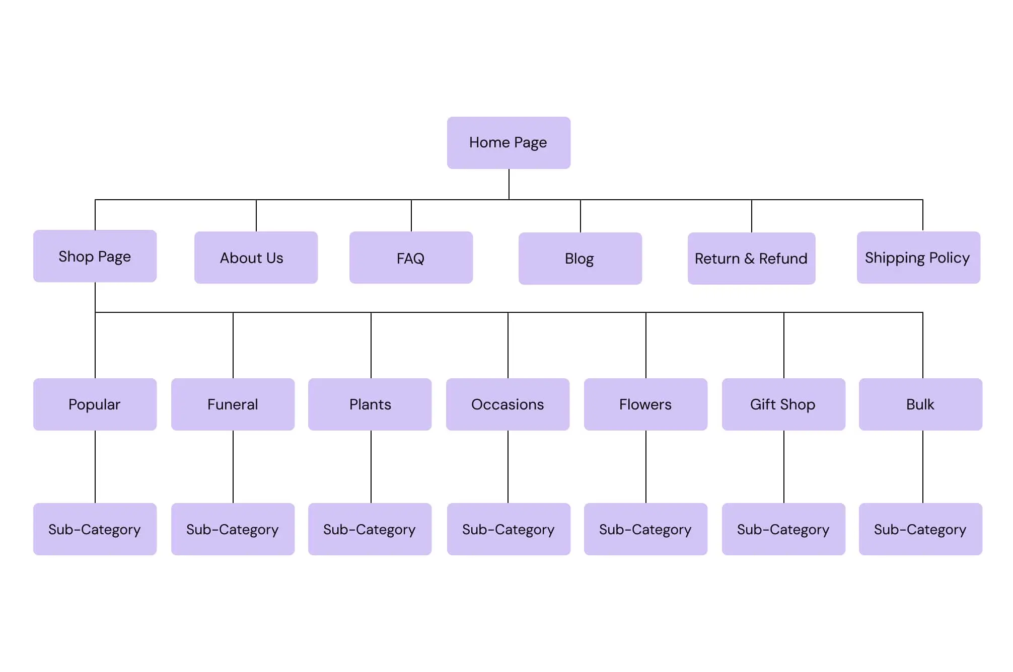
Information Architecture We created multiple product categories in a logical and user-friendly way. The products ( flowers) pages were categorized based on
- Occasions
- Arrangement types
- Single and bulk ( quantity)
- Plants
- Gifts – Additional offerings
SitemapThe site map was created for both web and mobile apps. This defines the main product categories for the business.
UI Design Implementation
We started by working on a visually appealing and user-friendly theme. Our team prepared wireframes and low-fidelity mockups.
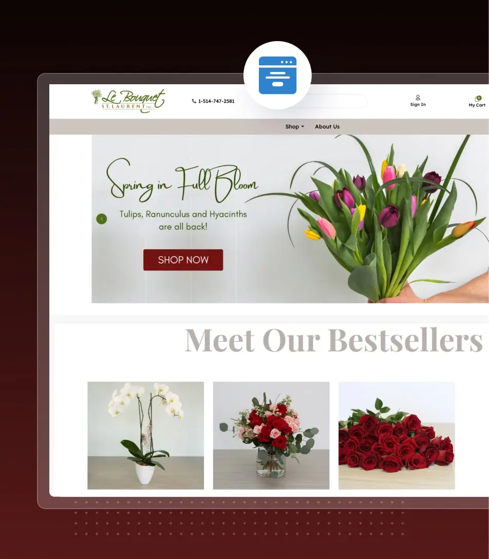
Home Page Design & LayoutHome Page was conceptualized with a clean and well-structured approach.
An intuitive user interface includes
- A bright, full-sized slider
- Products displayed with high-quality images
- Small content sections introducing what we do
- Footer page
Product Page Design & LayoutFor the product page, we emphasized using high-quality product photos.
- Simple and succinct product description
- Implemented product image gallery
- Extra variations like color to personalize the order
- Created an Add-On section, compelling shoppers to buy more
- Strategically placed CTA button
A clear and spacious design drives shoppers to act.
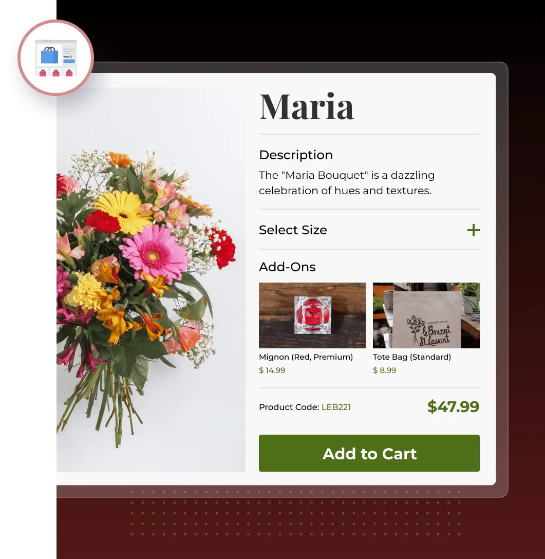
Our figma to WooCommerce developers created high-fidelity mockups. Featuring product images and interactive elements.
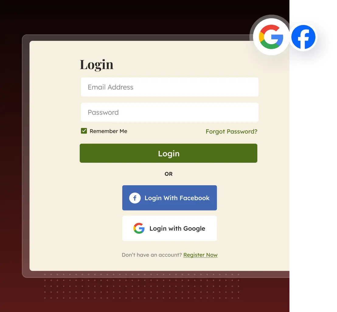
Implemented Social LoginsOver 77% of consumers prefer social logins when browsing an eCommerce site.
That’s why we created social logins, enabling users to shop online using Facebook and Instagram.
The solution can potentially improve sales as social sign-ins can boost conversion rates by over 10%.
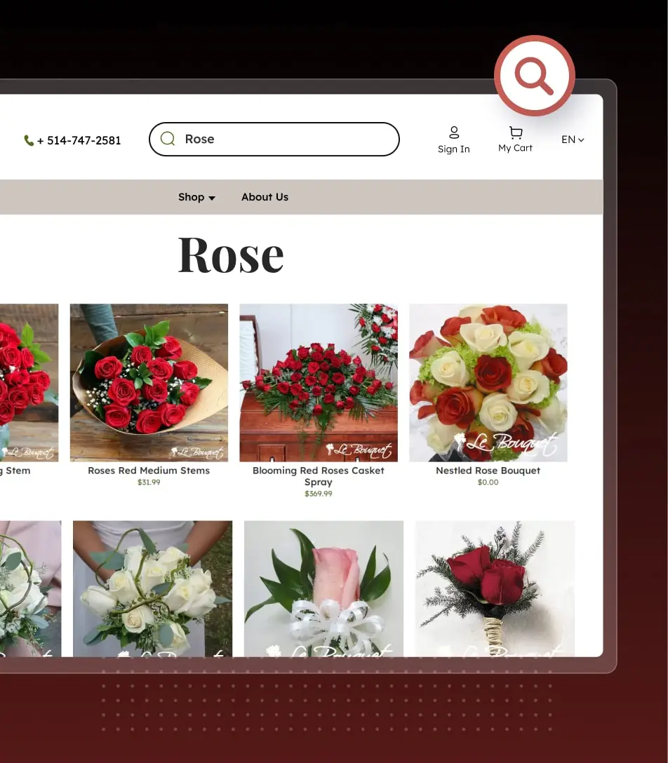
Implemented Search functionalityWe implemented a robust search functionality within the store. This allows users to find the products using keywords, filters, or categories.
Improved Sales: Customers can quickly find what they need, reducing bounce rates and driving more conversions.
Improved User Experience: Effortless product discovery keeps users engaged in shopping.
POS Solution for WooCommerce
The ultimate tool for seamless order management. This web-based application integrates orders, both from the online florist store and in-store.
Key Components: POS System
- Customer ManagementCreate an order for old and new customers.
- Flexible ConfigurationsConfigure the store and stand out
- Manage Multiple StoresCreate and manage multiple outlets with accuracy.
- Customized AccessAssign shoppers to outlets for customized access.
- Easy Cashier ManagementManage multiple cashiers within the POS.
- Streamlined Order ManagementManage orders in a few clicks.
- Bespoke ProductsAdd Requests for in-demand products
- Product VisibilitySet product visibility across online, POS, or both.
- Discounts and FeesApply a discount on the cart value while checking out.
- Robust ReportingGet valuable insights into store sales and product inventory.
Here’s a typical scenario representing the working of a POS Solution for WooCommerce

Woo Development
The developers translated mockups into code for the website. Our team integrated popular features to simplify the shopping experience while giving control to merchants.
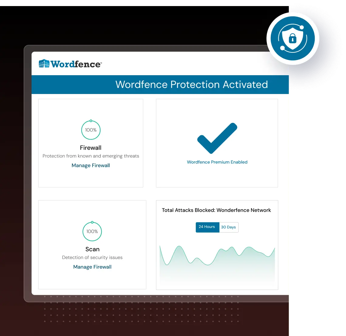
Integrated Wordfence Security PluginWe added another layer of security to build trust for shoppers.
The Wordfence WordPress security plugin provides free enterprise-class WordPress security.
It safeguards sensitive user data and information from hackers and malware attacks.
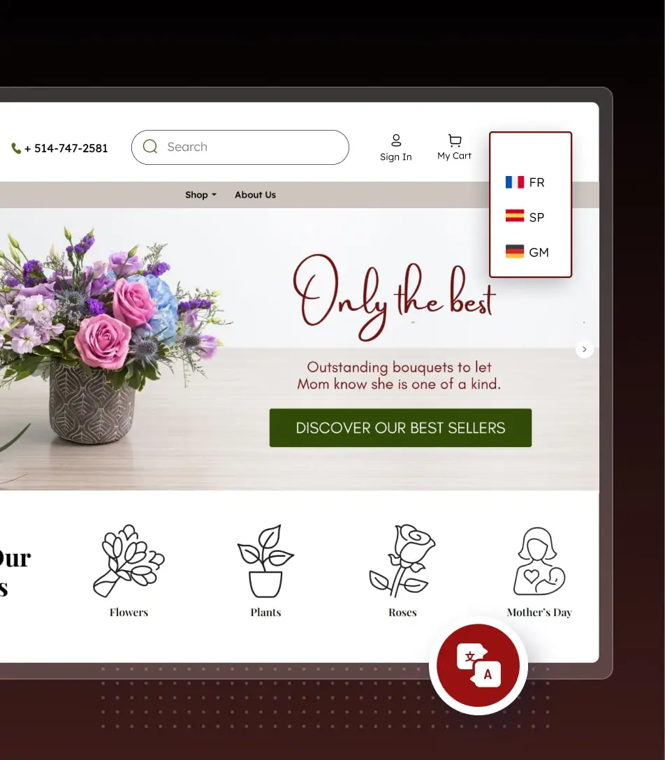
Multilingual WebsiteWe built a multilingual WooCommerce site that allows English and French customers to shop with us.
Plugin Selection: We chose a robust translation plugin that integrates seamlessly with WooCommerce.
Language Configuration: The plugin was configured to translate content based on user preference.
Language Switcher Integration: We placed a language switcher on the website. This helps visitors to switch between English and French effortlessly.

Integrated Moneris Payment GatewayUsing a reputable payment gateway fosters customer confidence in your store’s legitimacy.
We integrated the WooCommerce store with Moneris — one of Canada’s trusted payment partners.
Multiple Payment Methods: Pay using credit cards, debit cards, and digital wallets like Apple Pay and Google Pay.
Secure Checkouts: PCI-compliant payment solutions. Utilizing advanced fraud prevention tools and encryption technologies.
Result: A Classic Makeover of the Canadian Florist Store
Our Dev team revamped the look and feel of the florist website. Every step was targeted to help the clients drive valuable business results.
We observed shoppers’ behavior and website performance over the next 3-6 months. We noticed promising signs with reduced bounce rate and cart abandonment rate. An increased number of shoppers made secure online payments without facing any glitches.
We have set the website to scale and explore untapped sales opportunities in and beyond Canada.
Ready to Discuss?
Share your project details and get a tailored proposal for your business.
Get Started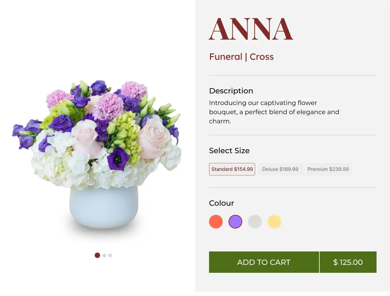




“We are very happy with the overall work. The entire process was well-planned and delivered on time. Amazing team to work with! We are continuing working forward with them”