SaaS Usability: Revamping the User Interface (UI) with React JS for Growth
Software as a Service (SaaS) product is a proven software distribution model that has gained huge popularity over the internet. It provides instant access to the customers, rather than requiring custom installation or physical media.
Behind all the automatic management and updates, there is a provider who centrally hosts the SaaS product for the customers. The customers simply access and utilize it through the web or mobile browsers.
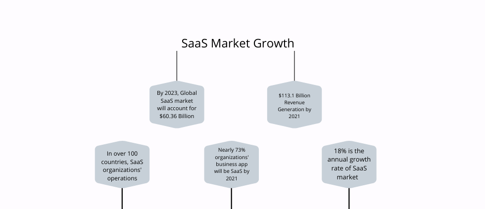
In the past, SaaS has revolutionized the whole software delivery concept, with a promising future ahead. The growth and importance of SaaS products can be easily evaluated from the statistics depicted below:
Despite gaining such popularity and constant growth, the success of SaaS products is getting restraint by the UI and UX it offers. After all, customer success is all that is required in the SaaS field.
The consumers play an important role in the whole success of a SaaS product. To measure success, the overall consumer sentiment is measured, i.e., whether they are seeing the value in your SaaS platform in terms of accessibility and usability or not.
The SaaS companies that are growing simply put emphasis on customer success. One fine example is Microsoft. It is one of the extremely successful SaaS businesses with an annual growth of 45 percent.
Focusing on the SaaS application design while encouraging a seamless UI and adapting to change are the two key ingredients of Microsoft’s success.
Major pain points challenging the success of a traditional SaaS product UI:
One biggest challenge for SaaS product’s UI today is engaging the consumers in the long-term. In case, you plan to retain the consumers and don’t wish to lose them upfront, you require to optimize the whole user experience with custom SaaS design.
This is the best option to start with while progressing towards other user’s touchpoints of the application.
The design of a SaaS application typically focuses on goal-driven behavior. Almost every product owner first identifies and then develops a set of functionality for the SaaS software, catering to both the business goals and the end-user.
However, there always remains some common UI issues that stay inattentive by the business owner.
So, what are they? And, how can you overcome the same?
Let’s have a look below:
- Basic Layout
The layout comprises several elements that you make accessible at the user end when they are on the dashboard. For instance, a search window, sidebar, visuals access, etc. are some of the common elements that a user looks for while interacting with a web application.
How you arrange all these elements together to narrate your business story leads to the layout structure.
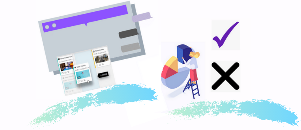
So, where lies a great solution for designing an impressive and highly usable SaaS applications?
Possible Solutions:
The homepage or the layout that a user sees when logged in is the very first impression. In today’s age, users live in abundance and there is a constant decrease in attention span from their end.
The users prefer a solution that is simple and easy to explore and less error-prone.
One possible solution that can cater to the need for an impressive layout is choosing a progressive disclosure. This term refers to a simple way where you only reveal a few of the most important options instead of overwhelming the users with each and every information.
By doing so, you can simply bring their focus to the most important features, without threatening them with so many categories all at once.
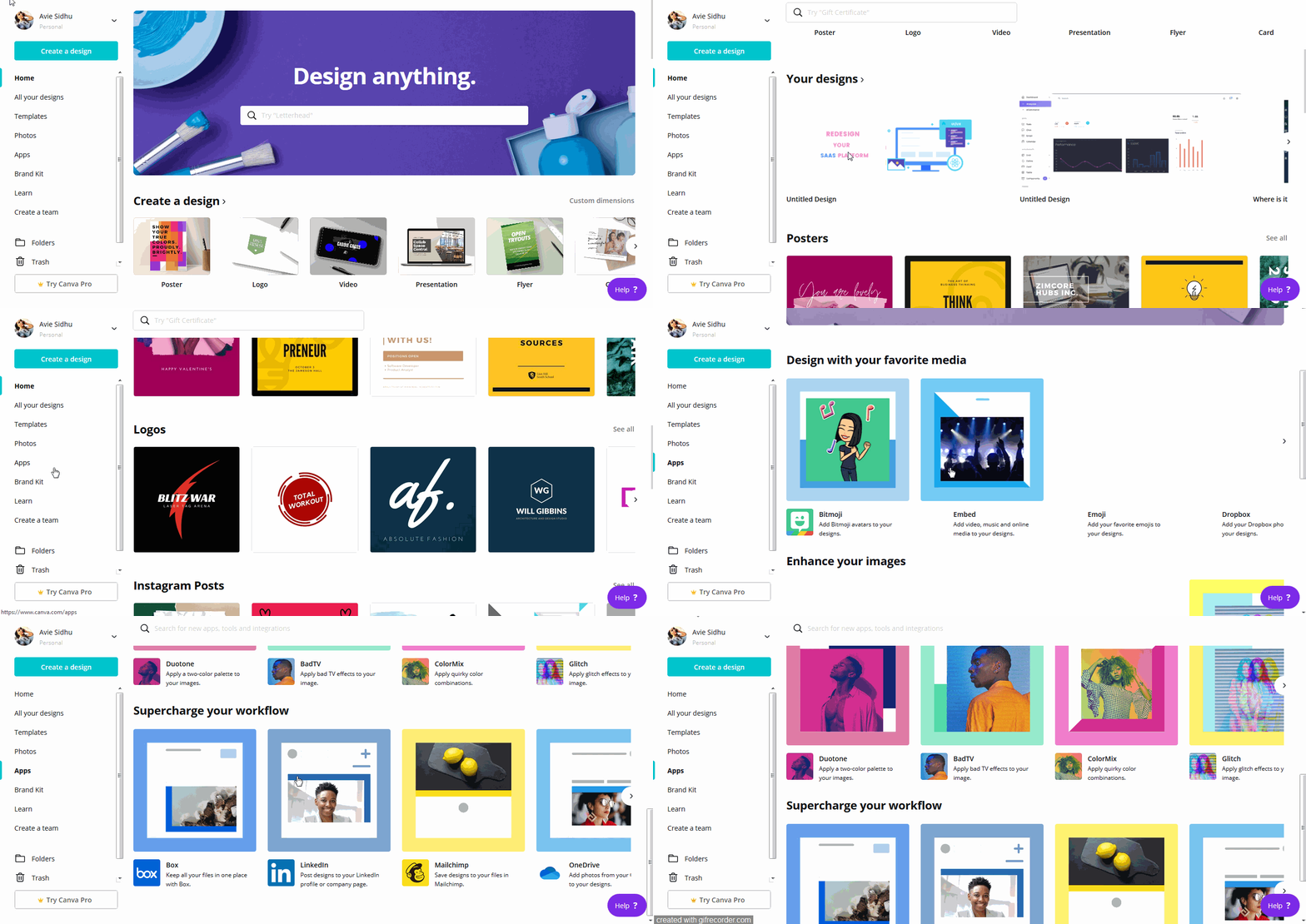
The above-mentioned example of Canva- a graphic design platform, is a great example of a progressive disclosure where a user sees fewer yet important features at a glance, followed by a plethora of choices available for them.
Undoubtedly, such designs of a SaaS application can do a great portion of usability optimization.
- Ease of use
Today, having a SaaS product that meets all the user requirements, isn’t going to make your business a success. It has to be simple and easy to use from the time a user signs up. Being traditional and original might not always work for you.
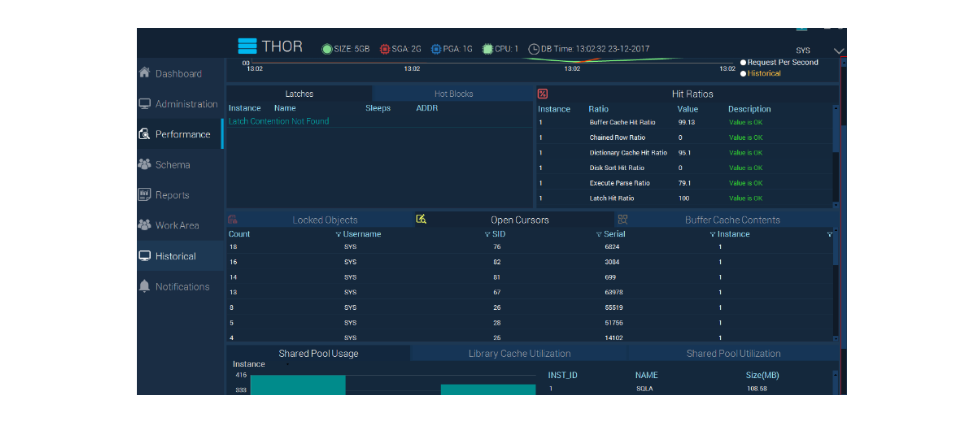
The illustration depicted here has been taken through UX Stack Exchange. And, it clearly indicates the bad design practices that can easily derive the need for redesigning of SaaS UI. Here, if we see closely, some of the relevant information is hiding or overlapping.
Additionally, the scroll bars are too close, making the users hard to scroll through the information. Lastly, it is highlighting two tabs of the sidebar navigation that might be confusing for some on which window they are landing on. And, if you also suffer from such hurdles on your website, it is a time for a UI redesign.
Possible Solutions:
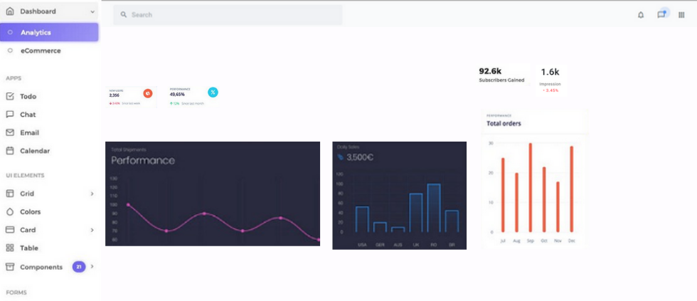
Try to organize all the information, widgets, tutorials, pop-ups, and functionality in such a way that the users find accessing and using them very friendly. Below, I have illustrated an example of a perfectly organized UI that is easy to use and visualize as well.
In addition to choosing a simple and sorted layout of your SaaS design, it is imperative that you make it mobile responsive too. The layout that you provide them over the desktops, needs to stay structured and well-aligned on the small screen devices too.
Apart from the layout and the visuals, one unavoidable concern is the functionality of your SaaS application. Some times, the clients require some unique features and functionalities that can cut down on their hurdles towards offering a frictionless exposure with their business.
And, it is only feasible via choosing a custom approach to SaaS design.
Probing further on this, below I have curated a real-time project of our overseas client who was in the need of a custom redesigning and development for his SaaS application.
CASE STUDY-Redesigning of SaaS UI
Recently, at The Brihaspati Infotech, our developers got an opportunity to work on some similar issues hampering the UI of a SaaS platform.
Our client holds a new concept of a search platform that allows the users to fetch precise, meaningful, and interrelated concepts of Life Sciences Research along with some references.
This latest and advanced solution is a great combination of AI (artificial intelligence), product dictionaries, ML (machine learning), and the feedback from the users as well.
Issues with Previous Design and Functionality?
Although the client had a unique and meaningful concept for the business, there were some pitfalls in the layout of this SaaS platform that called for a website redesign. For instance,
- Slow load times,
- Responsiveness was poor,
- A cluttered layout structure,
- UX resizing,
- And, poor view toolbar concepts & navigation.
All-in-all, it was a concept of redesigning the UI of a SaaS platform. While looking for the perfect option to overcome many of the above-mentioned issues, React JS was on the top of the chart. Undoubtedly, it is a robust front-end JavaScript library that served most of the above-mentioned issues.
With React js adoption, we were also able to overcome the burden of a heavy JavaScript code on UI in the previous version of the client’s project. Doing this kind of SaaS customization for UI helped the developers to cut down on the slow loading times of the application. Moreover, the visuals of the UI also revamped for better user experiences with the application.
Well, there were some other customs redesigning needs of the client that required our assistance. To embark on those, let’s get through a detailed list of client’s requirements with appropriate custom redesigning solutions for the SaaS application that we delivered.
Theme Personalization
Personalization is a universal concept that stays everywhere. And, this time the client wanted to leverage personalization in the theme selection. The client wanted to assign different theme colors to different topics.
Also, he asked for flexibility at the user’s end as well where the users can select another theme instead of the default one.
Our Solution:-
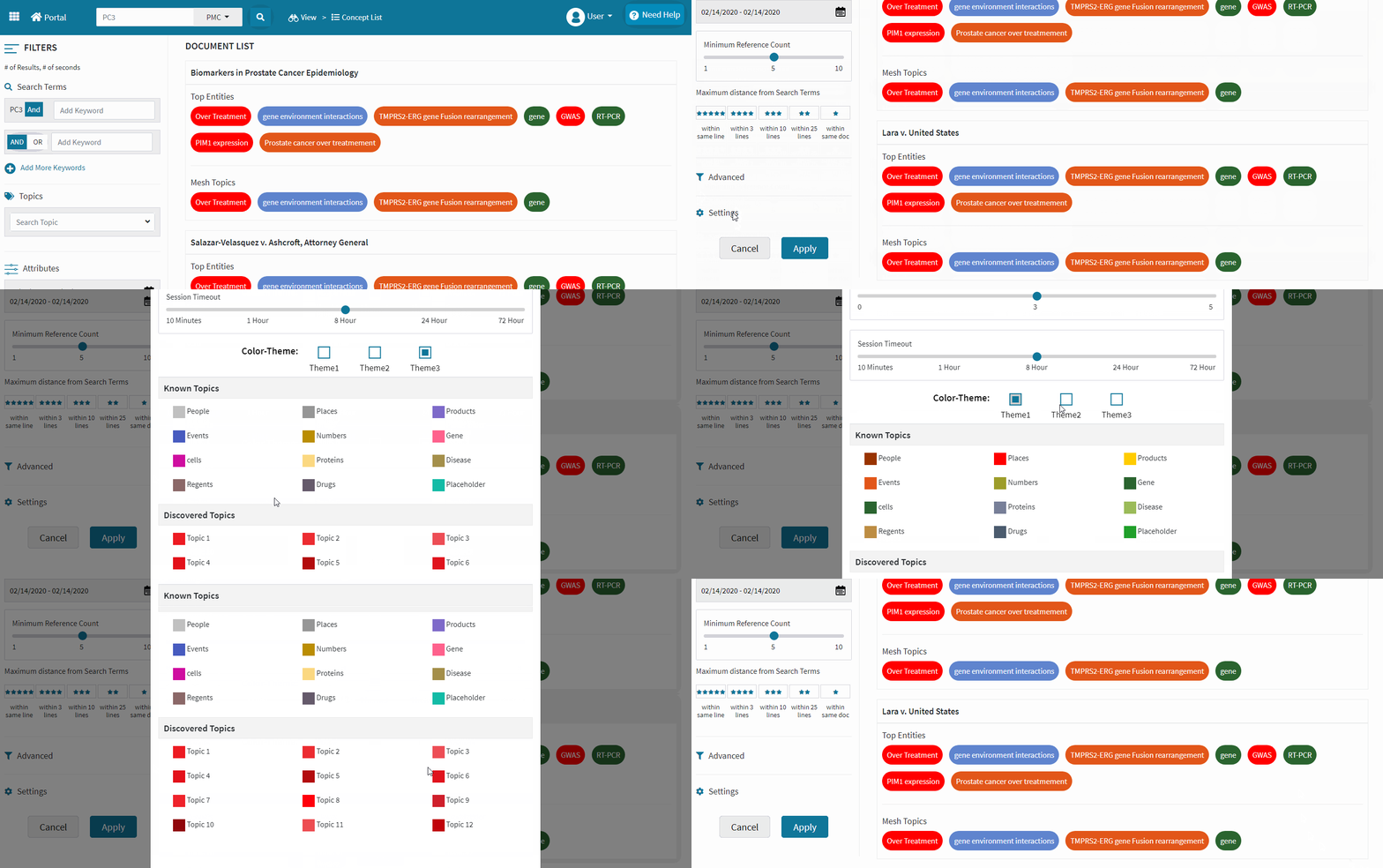
As we can see in the above gif, the client has three choices of the theme from where the users can get different other color choices depending upon the topics. To achieve this, our team of developers chose the color ID matching while creating a custom logic with jQuery.
Simplified Layout
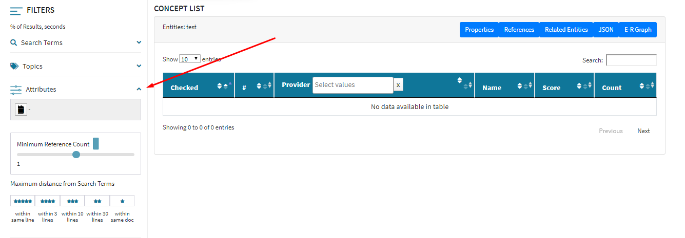
As discussed above in the challenges of a traditional SaaS product, the client was also looking for a simplified and less cluttered side navigation bar. Whenever the clients hold a huge database, it is always preferred to have an expandable and collapsible content holder that contains multiple tabs for different sections.
A similar need was for our client’s project. Due to a plethora of options available under ‘search keywords’, ‘topics’, and ‘attributes’, the client demanded expansion panels in the side navigation.
Our HTML designer team was able to achieve it skillfully with jQuery while calling the UI Accordion and other requisite APIs. A glance at the final solution is shown below:
Custom Topic Display Listing
Another requirement of the client was a custom display listing of the Topic search section. He wanted to create a drop-down list from the search bar for the different topics where a user can see the tags of choices made, just above the topic bar.
Also, he wanted to disable the already selected choice of topic from the dropdown list, i.e., once the user chooses a topic from the list, it will display at the top of the search bar and will get disabled to again select or deselect from the list.
If the user wishes to remove that topic choice, he will have to cross it from the tags display.
Our Solution:-
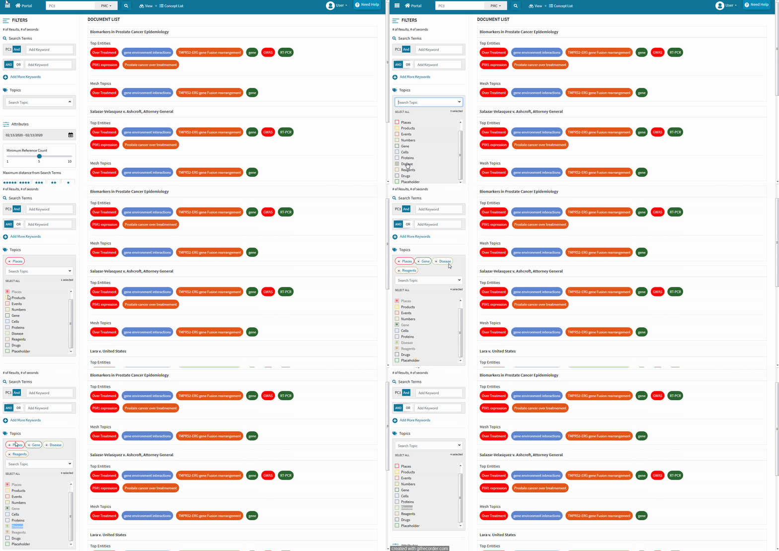
To achieve the desired functionality of the client, our team of developers created a custom solution with a perfect mixture of HTML and jQuery APIs.
Parting thoughts!
Here, I would like to emphasize the importance of design again in the overall success of a SaaS solution. And, the concept of design is not restrained to the startups or first-time setting up portals.
There is always a room for revamping the whole UI/UX of an existing SaaS solution that can be achieved with a redesigning approach with the latest and more advanced technology like React js.
Having said that, our team of designers is capable enough to realize any vision practically. If you also have some unique and custom needs, feel free to contact our team of experts.
Try out a custom design approach to gain more popularity and business growth!
Stay Tuned for Latest Updates
Fill out the form to subscribe to our newsletter
