Responsive Vs Adaptive Web Design-One Web Approach
The tectonic shift in user behavior in this post-PC world clearly reveals that desktop users will soon be a minority on internet. 50 to 60% of the devices that contribute to your website traffic are mobile devices. Owing to these tectonic shifts we’ve smartly moved through this era to the one where adaptive and responsive design themes rule the web world. Also, by comparing Responsive vs Adaptive Web Design, we’ve summed up the pros and cons of both to let you decide which best suits your requirements. By all means web developers these days do their utmost to create a website that provides quality user-interface, irrespective of the device being used.
W3C calls it as “one web approach” where a single responsive or adaptive design works well on all kinds of devices. From a web developer’s perspective a website must be developed for a high resolution desktop, low resolution mobile device or medium resolution tablet. Plus the unimagined screens of future must be taken into consideration before creating a web application.
To deal with the opportunities ahead, there are two methods for “One web Approach”—
- Responsive web design
- Adaptive web design
Adaptive web design further falls into two sub-categories–
- Server-side Adaptive
- Client-side Adaptive
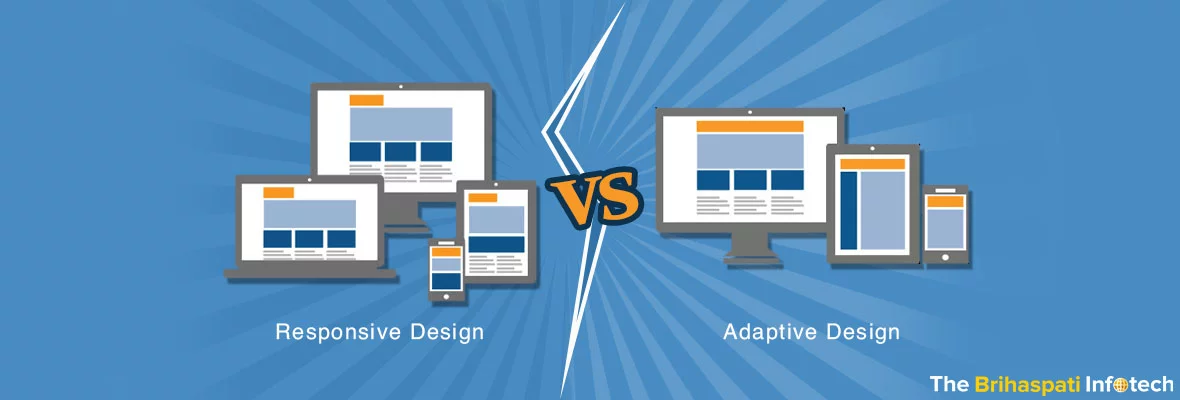
One on hand responsive website has long been portrayed as the top-standard for converting hitherto desktop-only web applications to mobile based websites. While the nature of adaptive layouts give more control over website design. Both the approaches viz. responsive vs. adaptive, have their own strengths and weaknesses that need to be considered before picking anyone of them.
ADAPTIVE WEB DESIGN
Though adaptive layouts demand more work than their responsive counterparts, it is the easiest one to follow while retrofitting a hitherto desktop-only website to be mobile friendly.
Server Side Adaptive Design
In server-side adaptive designs, the design changes occur at the server end mainly through custom user agent detection or using server-side plugins. This is most followed because it just requires designing for specific viewports, and also offers specific templates for some devices. This leads to the development of small device specific pages that loads quickly. Distinct templates for different devices allow high-level device specific customization, and various server-side plugins are also available for e-commerce systems and other content management systems. However, use of server-side adaptive methods requires some major changes to the back-end systems, which are quite expensive to implement. Also, the requirement of multiple templates for specific devices increases maintenance costs.
Client Side Adaptive Design
This is the kind of adaptive approach where changes occur on the client side of the spectrum rather than on the server side. By client side it means the changes can occur either on the web server or in user browser. This detects different devices and then loads the correct template as required by the user. Following this approach, a developer is not required to re-build the entire website from the scratch. He can work on the existing content without compromising on delivering mobile responsive layout. If a website is getting high traffic from users specifically using iPhones, then by using client-side adaptive method you can optimize specifically for iPhones. However, using this technique requires a higher level of skill set in context of using JavaScript, as compared to responsive design approach.
RESPONSIVE WEB DESIGN
This is, by and large, the most widely used one web approach where designers can use a single template for all the devices. This approach makes use of CSS media queries to change the look and feel of a website based on size of display devices. Bootstrap and Foundation are some open-source toolkits that make building responsive websites all the more easy. The designers and developers don’t need to work with technologies other than HTML and CSS-something they are already familiar with. However, responsive layouts mess up in the testing process, as it is quite difficult to customize the website for all the devices. These designs rely on flexible and fluid grids. Such method works well if the website is optimized firstly for a mobile device, and then progressively for tablet and desktop users.
Both the approaches work towards making websites perfect for different screen sizes and ultimately providing better user experience. Responsive webs design relies on flexible and fluid grids while the other is dependent on predefined templates. The latter follows a layered streamlined approach while former implement strategies using CSS Media queries, fluid grids and flexible foundations.
We have a skilled team of web developers and designers with extensive experience in responsive and adaptive layouts.
For further information on responsive and layered “one web” approach method and to avail our services you can reach out to us HERE
Stay Tuned for Latest Updates
Fill out the form to subscribe to our newsletter
