How Twitter Bootstrap Helps to Build Mobile Responsive Websites ?
In present world, with the change in technology and global expansion of E-commerce and M-commerce market, our way of doing business has also changed. Also, the demand for responsive websites and mobile applications are also increasing drastically. So, the need to develop these responsive sites in the shortest span of time has also increased even more. That is why demand for ‘Bootstrap’ comes into existence.
Why we need Responsive Web Design or Layout.?
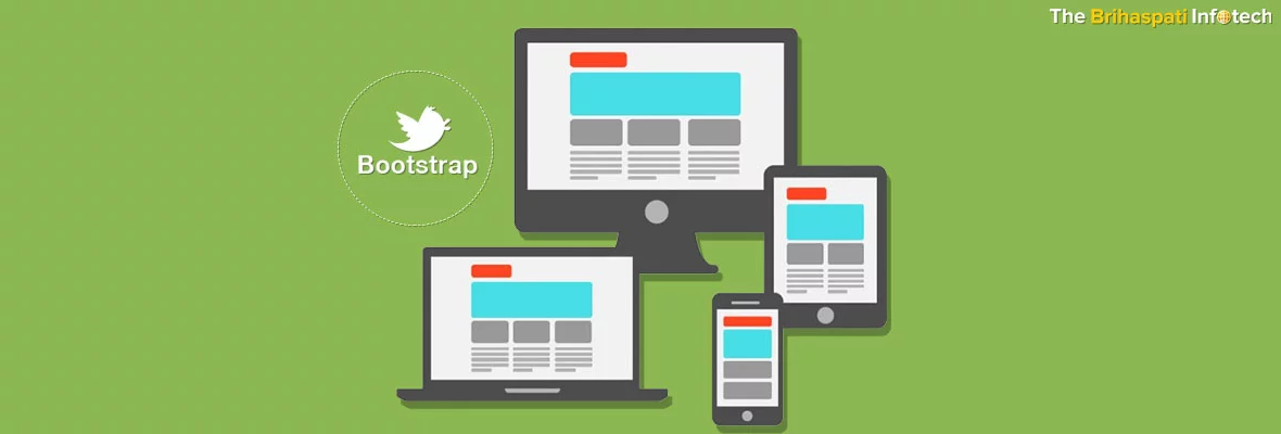
In the growing trend of smart phones and tablets, it is hard to ignore the optimization of sites for mobile devices. Across a website, ‘Twitter Bootstrap’ conveniently allows more effective implementation of a unified look.
A Responsive web design allows user with an optimal viewing experience and better accessibility.
In a Responsive Web Design a layout is created for optimal viewing and interaction experience by adapting it to the viewing environment. It is generally carried out by using proportion-based grids, fluid, flexible images, and CSS3 media queries.
The new version of Bootstrap 3 mobile first grid system makes it much easier to create the responsive and mobile friendly websites. Here to enable responsive feature, there is no need to include any additional style sheet. It provides four tiers grids classes to allow better control over the layout, which can be easily rendered on different devices i.e. large screen, desktop, laptops, cell phones, tablets, etc.
Why we should use Bootstrap ?
Responsive web design relies on CSS3 media queries to target different and specific screen resolutions and sizes. While starting to create a responsive design requires more work, mostly with CSS code and some JS with lots of planning & thinking about the UI, how it scales and users interaction with it and so on. The biggest downside is a whole lot of testing. The only best true way is practically using the responsive design with CSS coding on a device. If it is not up to the mark then change the code.
The good part with ‘Twitter Bootstrap’ is that we can start creating responsive designs in an almost magical way. Its inventors have rightly defined it as a sleek, intuitive, and powerful front-end framework for faster and easier web development.
Although, Bootstrap is built with CSS at its core, still it is built with a flexible pre-processor named ‘Less’, that allows better flexibility and power than a regular CSS.
Primarily, we can gain two useful benefits from Bootstrap as it is a purely CSS when compiled via Less.
A. Bootstrap is convenient to implement just by entering code. Also, Compiling Less can be executed from an unofficial Javascript Mac application or via Node.js.
B. Bootstrap contains no superfluous images, Flash, or Javascript after compilation. Only simple and powerful CSS left for web development requirements.
Other Important Factors, which justify the use of Bootstrap, described as follows:
Minimum Time Wastage
A web developer can pump life into a website using the Bootstrap libraries which provides ready-made pieces of code. Spending time on laborious designing work and writing code can be saved by simply finding and fixing the right piece into the structure.
Customization
A great feature of Bootstrap with which a developers can tailor their development project as per their need.
Design Factors
A. The Grid
A decent grid can be used to create page layouts. Although it is not mandatory to use the platform’s grid, still it helps to make a whole job lot easier.
B. LESS is more
LESS mixins and CSS manipulations can be used to customize the built-in grid. On all browsers, using the most popular CSS3 utilities, Bootstrap as a homogeneous reaction brings them to life.
C. JavaScript
Bootstrap comes with the JavaScript libraries which become an integral part of a web design. Manipulation of Tool-tips, Scroll-spy, Modal windows alerts, Button, Popover, Type-head, etc. can be easily managed with Bootstrap. Moreover, Bootstrap allows even to skip script writing altogether.
Consistency
This consistency tool-set was developed to resolve big inconsistencies of Twitter between developers working on their projects. Bootstrap works with a central set of development code and its results are uniform across platforms, like on Firefox, Chrome and Internet Explorer.
Updates
Updates with Bootstrap, come out with much more regular and constant basis. The Bootstrap team starts to fix it, as soon as problem is seen by web developers.
Integration
The Bootstrap can help to iron out the creases of a live site . For e.g. if table styling is used, then take the required styles and copy them to the working CSS file. Link up the working file with or hotlink to Twitter, Bootstrap will immediately kick in with its customized style .
Finally, once you’re done with simple integration or fast and easy to accomplish Integration a developer can play with design to a heart’s content.
Responsive Design
While shifting from a laptop to an iPad and from an iPad to a Mac, no need to fret over a work. As Bootstrap adapts to the change in platforms with super speed and efficiency.
Compatibility with Future
As the future of design itself, Bootstrap is equipped with many elements. Since both HTML5 and CSS3 are going to be big in the future of design and development. So, in the coming years, for web developers, Bootstrap has the potential to become a yardstick.
Competitors
A more realistic competitor of Bootstrap is Zurb Foundation, besides JQuery UI and the HTML5 Boilerplate. Bootstrap 2 leads in having a tool-set as compared to Foundation. Also, various third party plugins with a plethora of features, codes and themes etc. are available with Bootstrap as compared to Foundation.
Documentation
Bootstrap comes with an impressive documentation. It provides, a head start without any play to learn and instead through the documentation allows to find information on anything.
An Employer Choice
Bootstrap come with good architecture and all modular approaches, so there is no need to spend a lot of time learning its use. From the perspective of an employer, when compared to HTML and CSS, a Bootstrap framework won’t require to spend much time to learn. Moreover, it allows an immediate quality work, and facilitates efficient, outcome-oriented design communication.
Twitter Bootstrap can provide various out of the box fabulous tools :
- We can reset link styles, grid system, background type, and two simple layouts with global styles for the body.
- Common HTML elements styles for tables, typography, code, buttons, forms and a little icon set.
- Common interface components with basic styles for pills and tabs, navbar, page headers, alerts, and more.
- Javascript plugins for popovers, tooltips and modals, etc.
How to start with Bootstrap.?
First download it from Bootstrap link. Every document can be found there, including tutorials and some basic guides.
Importantly, download the Bootstrap framework from homepage or preferably a customized version to choose and select as per need or want. It comes with just one CSS file with all the essential responsive media queries.
On a Customize Bootstrap page, we can turn off/on JS plug-ins, UI components, CSS styles, define fonts, responsive queries, colors and so on. Enter on the “Download Customized Version” button and keep everything by default.
After downloading is over extract the package to get the following:
|
1 2 3 4 5 6 7 8 9 10 |
– bootstrap/ — css/ — bootstrap.css (safe to delete) — bootstrap.min.css — js/ — bootstrap.js (safe to delete) — bootstrap.min.js — img/ — glyphicons-halflings.png — glyphicons-halflings-white.png |
Now, delete the non-minified versions of the CSS & JS files (bootstrap.css, bootstrap.js) as it will be no longer needed to fix or edit any of the bootstrap code. Then include them into your project. We can imagine a blank HTML file as shown :
|
1 2 3 4 5 6 7 8 9 10 |
<metacharset=”utf-8″> title>No Boostrap in this project
Hey, i wanna be responsive too 🙁 |
Reference the CSS file and JS file to bootstrap. Example:
|
1 2 3 4 5 6 7 8 9 10 11 12 13 14 |
title>With Bootstrap
–
Hello Bootstrap! |
Important:
- Don’t include any JS files for Bootstrap functioning, the CSS file will provide all the responsive features, CSS styles and grid but JS files may be needed for some parts of the framework like tabs, alerts and so on. If are using Bootstraps JS plugins, also include jQuery.
- To avoid page rendering and CSS loading time, put all JS files at the bottom of HTML and follow the ySlow and Google PageSpeed rules for faster website loading and page optimization.
Now start using all the magic that comes with Bootstrap.
Basics of Bootstrap
Bootstrap offers 12 column grid including two options:
- fluid – Choose this, if 100% wide for an app is required using up all the width of the screen.
- fixed – Choose the 940px option, if creating a standard website without need for all 100% of the screen.
Important: By default Bootstrap has a media query for “large desktops” so, the 940 px grid becomes 1170 px wide, if screen resolution is more than 1200 px. Therefore, turn this off in the customization section.
For exp, On a homepage, while using the fixed layout to create 3 boxes and to float next to each other, Bootstrap do the magic as shown :
<metacharset=”utf-8″>
Getting started with Bootstrap
<linkrel=”stylesheet” href=”http://flip.hr/css/bootstrap.min.css”>
<divclass=”container”> <divclass=”hero-unit”>
Awesome responsive layout
Hello guys i am a “.hero-unit” and you can use me if you wanna say something important.
<aclass=”btn btn-primary btn-large”>Super important»
<divclass=”row”> <divclass=”span4″>
Box Number 1
Donec id elit non mi porta gravida at eget metus. Fusce dapibus, tellus ac cursus commodo, tortor mauris condimentum nibh, ut fermentum massa justo sit amet risus. Etiam porta sem malesuada magna mollis euismod. Donec sed odio dui.
<aclass=”btn”href=”#”>Click meeee»
<divclass=”span4″>
Box Number 2
Donec id elit non mi porta gravida at eget metus. Fusce dapibus, tellus ac cursus commodo, tortor mauris condimentum nibh, ut fermentum massa justo sit amet risus. Etiam porta sem malesuada magna mollis euismod. Donec sed odio dui.
<aclass=”btn”href=”#”>Click meeee»
<divclass=”span4″>
Box Number 3
Donec id elit non mi porta gravida at eget metus. Fusce dapibus, tellus ac cursus commodo, tortor mauris condimentum nibh, ut fermentum massa justo sit amet risus. Etiam porta sem malesuada magna mollis euismod. Donec sed odio dui.
<aclass=”btn”href=”#”>Click meeee»
In this way we can create 3 boxes with nice default styling. We can also add some content in the boxes to make to look it more appealing. The best part is that everything is responsive, on re-sizing a browser.
Now try breaking it down a bit:
- < div class=”container” >< /div > – Essentially, it serves as a wrapper for all page content. Surprisingly, on using a fluid layout just add container-fluid instead of container.
- < div class=”row” >< /div > – It is also essential for creating rows is a column wrapper to work on padding, margins and floating clears. Replace row with row-fluid,if using a fluid layout.
- < div class=”span4″ >< /div > – a DIV with class span* is basically a column and have 3 boxes in a row and we will get span4, if doing a simple calculation 12/3=4.
- < div class=”hero-unit” >< /div > – As an another Bootstrap component, this can added to make this sample more cool.
As we already know the basics, so we can see with only 3 CSS classes. The changes of .span classes depend on how wide we want our box/element, and they can go from 1 to 12. Therefore, a DIV with a “span12” class on large desktops can be 1170px wide, 940px wide on laptops, and smaller for phones & tablets.
Like above example, we can create responsive layout in few minutes. Moreover, if we further dig into Bootstrap docs, we can see there are UI components i.e. tabs, navbars, dropdowns, accordions, buttons and so much more. So, don’t skip to check out the Bootstrap Components page.
Another advantage for using Bootstrap is that we can use a number of cool and standardized JS plugins like tabs, modals, accordions and sliders which not only do excellent work with the default Bootstrap style but are also fully customizable and responsive.
Bootstrap Plugins and Tools
Preferably for a beginner, Bootstrap embeds with the most of the tools that a normal front-end developer would need. Professional and experienced developers can use following plugins or hacks to make their life easier :
-
-
jQuery UI Bootstrap Theme :
-
When building modern and interactive designs, a suitable jQuery UI theme is used by a lot of front-end developers. It works well and accompanies the Bootstrap design as it should.
-
-
Bootstrap Colorpicker :
-
This great Bootstrap plugin handles color picking in an awesome way.
-
-
Fbootstrapp :
-
This toolkit is invented to kickstart facebook iframe apps development in relevant sizes. Styled in the typical facebook feel and look, it includes base CSS and HTML for forms, typography, tables, buttons, grids, navigation, and more.
-
-
Bootstrap Dropdowns Forms :
-
It comes handy and is more of a hack, if we wanted to have login forms in simple to use Bootstrap Dropdown menus.
-
-
Awesome Fonts :
-
While building UI elements, if one like to use icons, then custom font can be used which is made of icons. In one CSS file especially for bootstrap, there are over 70 icons.
-
-
BootBox :
-
A small JavaScript library Bootbox.js allows to create programmatic dialog boxes using modals of Twitter’s Bootstrap.
Indulge in Bootstrap
In any case, we can use Bootstrap with any design. We can manage to turn any website into a a responsive site in a day or two. responsive one.
The design of site is so customized and different that on visiting the site mostly people would never accept that this is built on Bootstrap. We can use a few of components to make the difference i.e. hero units, navbars, buttons, thumbnails, modals, base styles and much more. On a website, for a full screen experience we can use Bootstrap’s fluid layout to save a lot of time to focus more on the design and UI.
Also, Bootstrap is very flexible and plays effectively with everything. Example; on a website, we can use more stuff like: lazy loading of images, custom modal loaders for Bootstrap, layout centering, hardware acceleration for page transitions, a lot of CSS3 transitions, transforms and effects.
The power of Bootstrap allows us to write some media queries of our own for responsive sites which look and feel same on all devices. Otherwise, it may take months for making a website and testing it on all devices and resolutions. So, it allows developers to focus more on the functionality, design and SEO stuff.
Conclusion
With this article we have tried to introduce Bootstrap in a good way and that you would give it a try.
Moreover, there is no end to what we can do with BootStrap. We can make it to look more personal by completely customizing it. We can add custom stylesheets, like “customstyle.css” or any other named CSS file. Using @import in “customstyle.css”, we can import all the BootStrap CSS files and then link this CSS file in our webpage.
We at TBI, have a team of experienced web developers and designers, who can guide and serve you for any of issue related to the use of ‘Twitter Bootstrap’ in designing of mobile responsive websites.
If you have any query or want to share any information or suggestion regarding Twitter Bootstrap, then you are welcome to Reach us. TBI would be pleased to contact you soon.
Stay Tuned for Latest Updates
Fill out the form to subscribe to our newsletter
